Icon Library: Prototype
UX + Web Development
THE PROJECT
Pushpay provides digital solutions to organizations in North America, United Kingdom, Australia and New Zealand. To better serve our mobile app users, my UX team (credit: Neil Deshpande) interviewed members of the customer relationship department.
From their insight and daily interactions with customers, we identified a major issue in the user experience journey: the icon library.
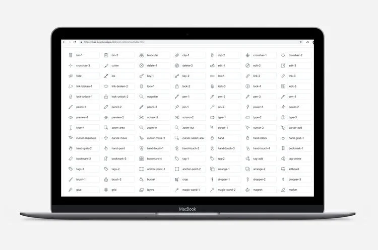
The icon library was a collection of over 1500 icons from Streamline, with some custom icons created by our team. These icons were used by internal and external teams when designing mobile apps. They were responsible for navigation and visual aesthetic within each app.
TEAM & ROLE
Date: November 2018 - August 2020
Team: Two UX designers and one web developer
My Responsibilities:
Interviewing
Prototyping (HTML5 and CSS)
Debugging & Maintenance (Github)
Collaborating with Engineers
THE PROBLEM
All 1500+ icons were displayed on one infinite-scroll page. There were no sorting options and could not be filtered into different categories.
Users would spend a lot of time searching for their desired icon.
They would often chose irrelevant icons, reducing the usability of their apps.
Many users grew overwhelmed by the icon library and lack of navigation. They were unable to save their favorite icons or or frequently-used ones.
Users contacted our customer service team with requests for an organized library regularly, adding to our product feature requests.
PROTOTYPE CONSTRAINTS
Permissions and Access:
As a growing startup, Pushpay had offices in Seattle (Washington, USA) and Auckland (New Zealand). Many engineers were located in New Zealand, leading us to collaborate remotely for the majority of the project. Gaining access and permissions from cross-functioning teams took significant time, especially with international time differences.
Search Bar Difficulty:
Developing a search bar would require building a secondary database (Javascript), servers (for hosting), and extensive usability testing. Our US-based engineering team was small, lacking the capacity to build out this feature, As a result, the UX team had to design a new prototype that would be easy and intuitive for users to find icons, without a custom search bar.
Understanding the Problem
Our UX team uncovered the surface-level problem affecting thousands of users, but we wanted to find out more.
What were our users thinking, feeling, and doing while interacting with the design?
To answer these questions, we conducted user interviews and usability tests.
Insight
Problem
Icons are all over the place and there is no organization. “This is like finding a needle in a haystack.”
Next Steps
Understand a user’s mental model by performing card sorting sessions. Use these insights to redesign the library's information architecture.
Problem
The infinite-scroll design required users to remember the names of icons in order to search for them. Worse, icons weren't intuitively named: e.g. a raindrop-shaped icon was named, “blood.”
Next Steps
Categorize and group similar icons together. This way, users wouldn’t have to only rely on a search function to find icons, but could easily browse the library to find an icon.
Problem
Users were not aware of best practices when it comes to iconography in digital products. "I'm not a designer and don’t want to be, I just want to make an app that’s easy to use."
Next Steps
Create a shortlist of popular icons so users don't have to think too much. Also, create resources for users that want to know more about iconography.
Grouping by association.
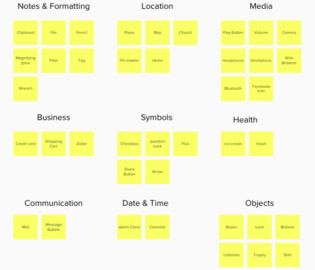
Open Card Sorting
Neil hosted an internal workshop to see if there were any icons that should be obviously grouped together. For example, he pre-grouped icons dealing with clothes such as ties, shoes, shirts, etc.
Doing this activity significantly brought down the number of "cards" we needed users to sort through.
This was instrumental in redesigning information architecture and understanding users’ mental models.
Brainstorming the information architecture.
Ideation
We began brainstorming ideas for our solutions. We also performed a competitive evaluation of other icon libraries such as The Noun Project, Font Awesome and Google’s Material library.
This helped us get inspiration for features. We also took note of certain features that might not be effective for users, avoiding implementing similar functions.
PROTOTYPE 1.0
Neil converted sketches and wireframes into digital mockups so that we could use InVision to create a prototype and test our design.
We then recruited more participants from the same user group as before. We ran a first round of testing, using the same script (read: assigned tasks) as before.
Neil wanted to see if the categorization and sidebar navigation were helping users find icons more easily. Once we completed this round of testing, he created an affinity map to synthesize our notes.
Categories
Tests showed that the sidebar made it easier for users to navigate and see all categories without having to scroll.
”It’s nice to see what kinds of icons exist and where they are.”
Affordance
We initially thought that putting icons next to categories would help users navigate, but in tests it actually confused users more. Some icon images didn’t match a user’s mental model of the category name.
Icon Size
Tests showed that protoype 1.0 had low scannability because the icons were too small.
PROTOTYPE 2.0
After analyzing the results from our first round of testing, we went back and iterated on our original design. Our goal for this round was to see if the larger icons and expanded categories helped users find icons more easily. The results included:
Reduced time and improved efficiency
Inspiration with different icons
Successfully sorting
PROTOTYPE 3.0
“Wow. I didn’t even know we had that icon. And we have three of them.”
-Beta-Tester
Following the results and iterations from Prototype 2.0, I set out to create the first working prototype on a local server. This version was built with HTML5 and CSS, and I collaborated with various internal teams to get the correct branding elements aligned with Pushpay’s style.
With the help of our web developer and other engineers, we deployed the project on Github. I continued updating the prototype with custom styling, bug fixes (e.g. missing icons or incorrect SVG files), and brainstorming new features that could be easily added.
FEATURES ADDED
Pages, not anchors
Our original design had included anchor tags for each category. Our web developer had recommended it as the easiest solution. Despite the convenience it would offer in code, I explained it was not an efficient way to display 1500+ icons.
Additionally, without the use of a ‘Back To Top’ button on the index page, the user would be subject to long scrolls. This would be similar to the existing icon library with infinite-scrolls. Instead of anchor tags, I suggested and coded separate pages for each category.
On-click function
Beyond organized categories was offering users the ability to simply click on an icon (or the text beneath it) and have text copied from its respective icon. This step of copying individual icon file names was a necessary part of our UX team’s daily activities. Introducing on-click copying reduced time and improved our efficiency. I worked with our web developer to implement this (with Javascript).
On-click visual indicators were also important, as they would help the user know a Javascript event/user interaction had happened. I compared different websites’ use of visual indicators, and added an inverse ‘black and white’ highlight on text. It was the clearest way to display a change in apperance.
Active Class
One feature I aimed to add was an ‘active’ indicator for the active web page a user was viewing.
Bolding the text or changing the color of the ‘active’ category was a simple task. But changing colors alone was not enough for web accessibility. I advocated and oversaw the addition of a ‘double line’ beneath the text, with the use of Javascript (thanks to our engineering team!).
PROTOTYPE 4.0


FEEDBACK
We presented prototype 4.0 to the rest of our UX team. As daily users of our CMS platform and apps, we felt their input would be the most valuable for beta-testing. After one month, we interviewed them to learn more about how their user journey had changed.
What People SAID
“Even though I have some icons memorized, I’m always discovering something new with the categorized library.”
— User A
“I’ve been using it since my first week [of being hired]! I don’t even use the old library.”
— User C
“I wouldn’t be able to find anything without [the prototype]. This library has saved me hours of time searching for the right one to use.”
— User B
“I use it almost every day for my app designs.”
— User D


