DAINTY DISTRICT | LOGO DESIGN
Branding / Logo Design
THE PROJECT
In 2006, I started designing and making fashion accessories, gradually progressing to handmade jewelry. However, I only established my jewelry business in October 2019. My business had a rich story spanning several countries. But it lacked a logo, a brand identity and branding materials.
oBJECTIVES
Create a brand logo
Form a strong brand identity
Design branding materials
CONCEPT
From a young age, I was exposed to a myriad of colors and cultures. My family moved from Singapore to South Africa, Japan, Canada, Hong Kong, and eventually the United States. East Asia’s fashion scene inspired me, because they were places where elegance co-existed with edge. My experiences also showed me that people didn't need a million dollars to be beautiful.
Therefore, I chose the name ‘Dainty District.’ ‘Dainty,’ to represent the delicate, feminine beauty many people used to describe my work, and ‘District,’ as a reference to fashion, textile, trade districts (across the world) where my supplies were selectively sourced from.The brand concept was: “A collection of beautiful, feminine accessories for every day life.”
PLANNING
I created a mood board of images, colors, and fonts that provided inspiration for the logo.
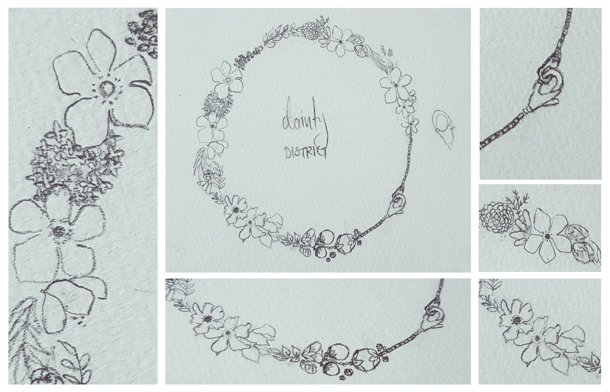
SKETCHES
DESIGN PROCESS
Brightly colored text on dark colored backgrounds were easier to see, accessibility-wise. I chose a dark blue-teal shade as the primary color. This color was subtle, sophisticated, and a popular color for clothes and design in Japan and Korea.
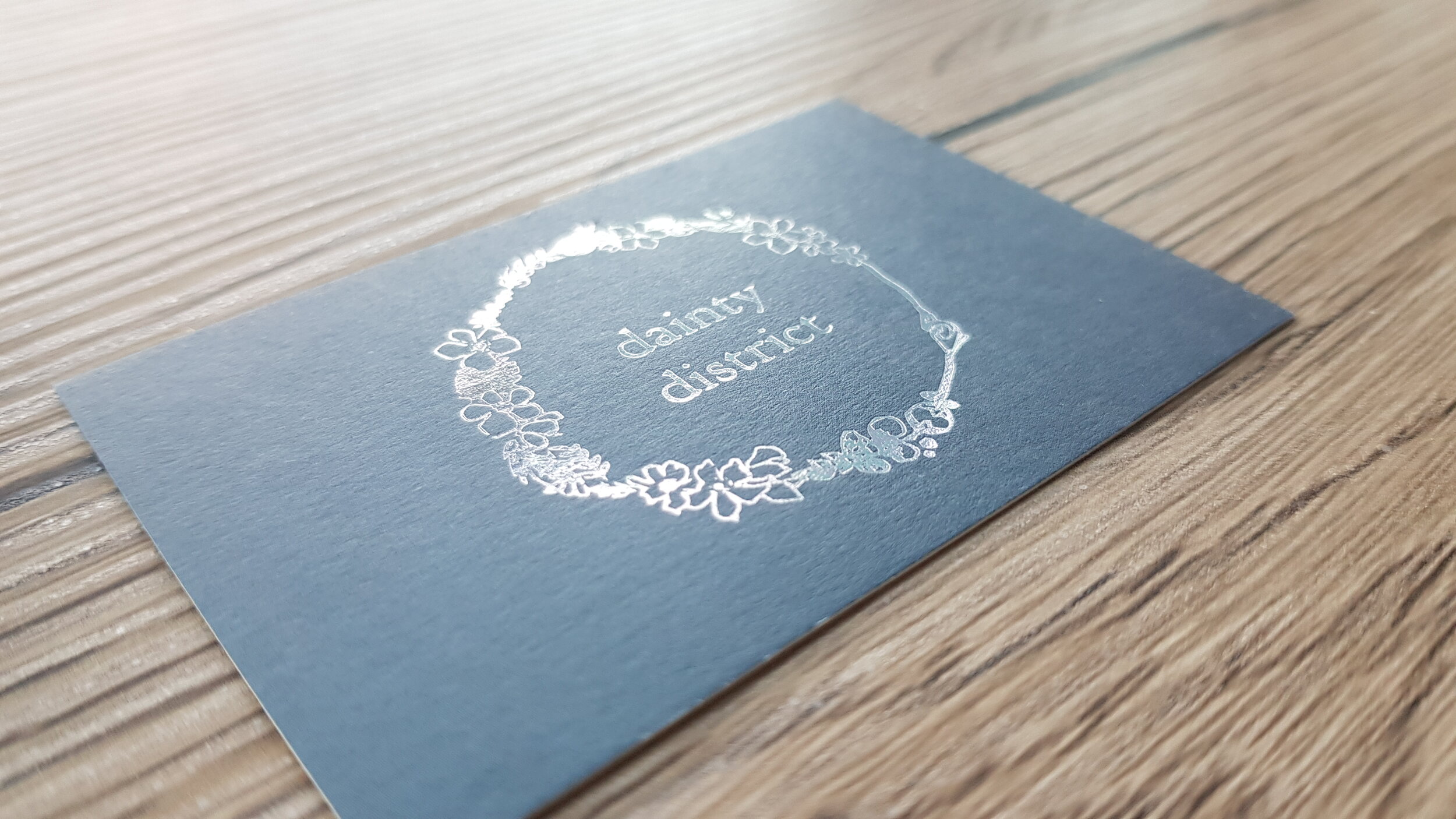
The logo itself would be white (if only two colors were allowed), or a holographic silver (on a business card). The holographic effect produced a rainbow of colors, which represented the multitude of jewelry designs available in the Dainty District world.
PRINTING PROCESS
I contacted Fastprinting, a specialty printing service for business card quotes. After I ordered a sample pack of card materials, I drafted my design and sent it to their team and designers. Here are the designs for the front and back of the card.
BRAND IDENTITY
With the logo design finalized in various colors and formats, it was ready to use for digital media. It was featured prominently on the online shop website, as well as the brand’s social media account.


